Role
UX research
Product strategy
UI design
Interaction design
Usability testing
Tools
Figjam
Figma
Dovetail
Maze
Google meet
Timeline
5 weeks (part-time)
Problem Overview
Patreon enables creators to monetize their work through direct fan support. However, the discovery experience is limited - primarily reliant on a generic search field. This restricts new and existing Patreons from exploring the vast diversity of creators, affecting engagement and platform growth.
Business Goal
Improve the discoverability of creative content and creators to increase:
Patreon engagement and browsing time
Fan-to-creator conversion rate
Creator satisfaction and platform retention
Overall traffic and monetization opportunities
Target Users
New and casual Patreons who want to explore content based on interest but do not have specific creators in mind.
Research & Insights
Conducted qualitative interviews with four participants to explore user behaviours and pain points. Used affinity diagramming and journey mapping to identify key themes.
Key insights
Users want to explore content by medium or genre
Creator pages are long and arduous to scan
Lack of preview leads to frustration and drop-off
Design Goals
Make discovery easier for new users
Enable users to scan creator pages quickly
Improve layout to reduce cognitive load
Ensure responsive design across breakpoints
Design Process & Deliverables
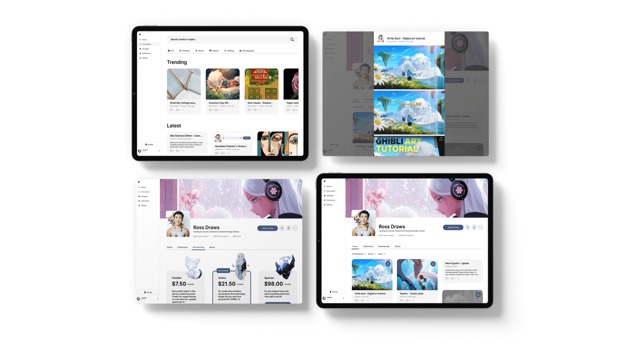
Redesigned Discovery Page
Filtering by content type
Scroll-friendly layout
Interest-based recommendations
Responsive for all devices
Creator Home Page Overhaul
3-column grid layout
Above-the-fold recent work
Pop-up modal for content view
Glanceable summary of offerings
Membership Page Redesign
Tier comparison view
Clarified access by tier
Responsive layout
Outcomes
Easier exploration and longer browsing sessions
Better first impressions and lower bounce rate
Increased Patreon understanding and conversions
Higher creator exposure and satisfaction
Reflection
Despite the tight 5-week timeline, discovering deeper user needs allowed a targeted expansion in scope. Prioritizing clarity and accessibility across screen sizes helped drive real value for users and creators.
Key lessons
Deep listening fuels better design
Small layout changes can unlock significant results
Design must balance user, creator, and business goals
Creator home page

Other pages that got redesigned